Hennigan’s
Non-Alcoholic Brew & Camp Starter Kit
Rooted in the rugged landscapes and untamed spirit of the Pacific Northwest, Hennigan’s embodies its story and represents a lifestyle. Hennigan's is the ideal companion for adventurers who embrace the region's beauty.
For this project, I designed non-alcoholic beverage packaging featuring laser-etched patterns inspired by the Pacific Northwest. Additionally, I created a sustainable growler carrying case, complete with a screen-printed pattern and logo. I also developed a sub-brand called "Vagabond," which includes a camp kit housed in a tent-shaped box with screen-printed branding.
Design Focus & Tools
Packaging Design, Identity Design
Adobe Illustrator, Laser Cutter, Cricut, Silkscreen-printing
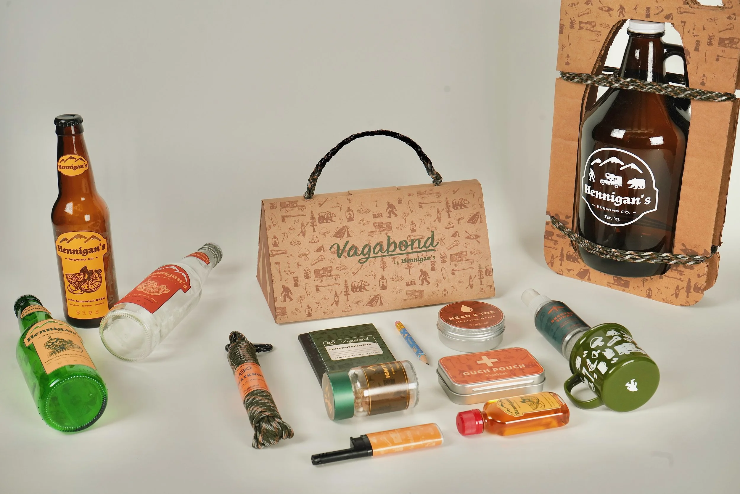
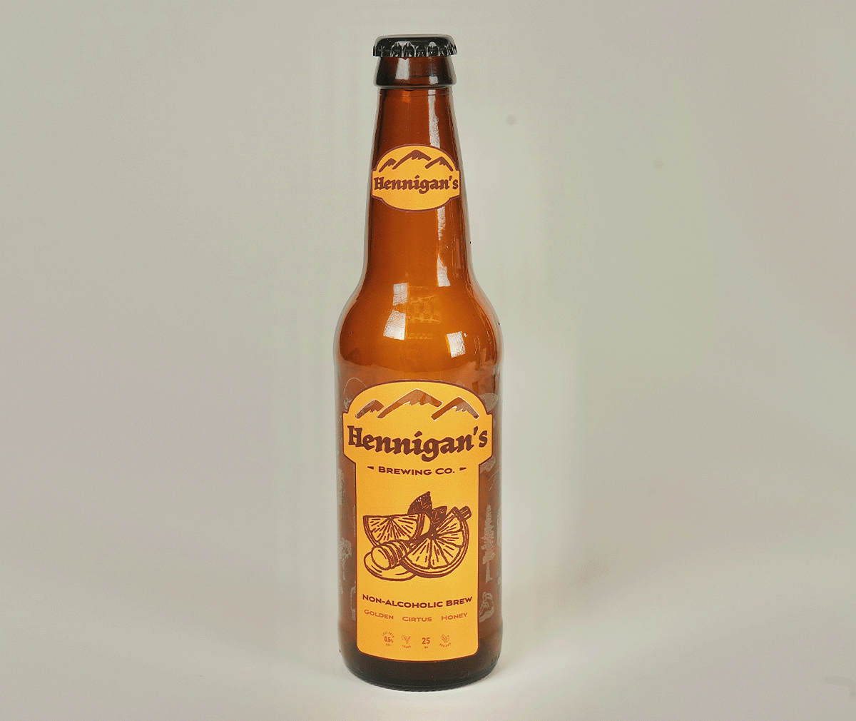
01— Beverage Bottle
About the Market
Why are NA beverages becoming so popular?
More and more people are adopting healthier lifestyles and are choosing to limit or abstain from alcohol altogether. Going alcohol-free is becoming more than a decision. It's transforming into a lifestyle and set of values.
Product Profile
Product Description: Non-Alcoholic Brew, Affordable Price Range
Target audience: For people who love the social aspect of connecting through drinks but prefer alcohol-free
Brand Personality: Adventurous, Authentic, Natural, Community Oriented
Product Differentiators: Natural Ingredients, Craftsmanship, Adventure-Inspired Branding
Moodboard
Somewhere between traditional and modern
Explorative, fun, textured typography
No rigid typography
Feels warm and hand done
Bold colors but maintain a limited palette
Alternating colors across flavors
Illustration pattern in the background
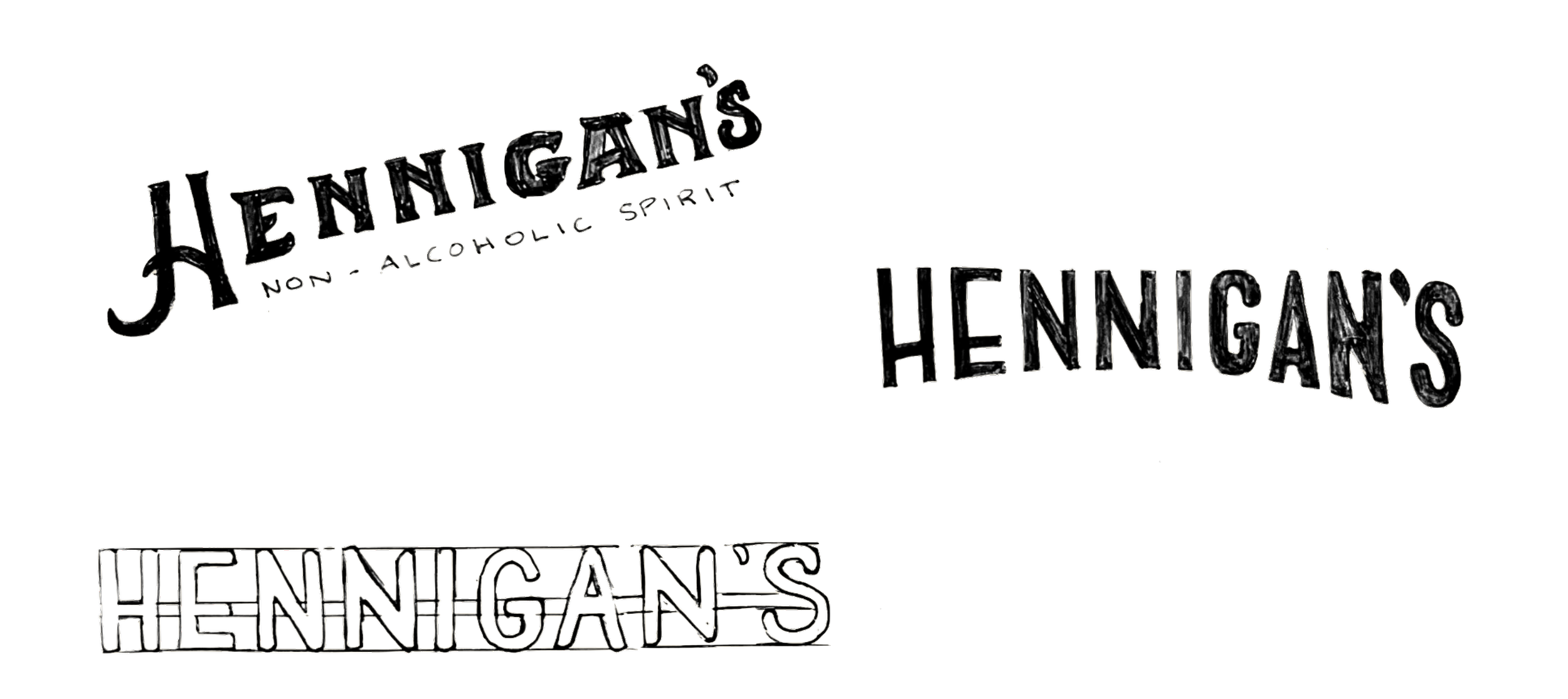
Paper Sketches
Blending traditional and modern aesthetics
Typography that flows naturally and evokes handmade warmth

Digital Illustations
A Pacific Northwest-inspired illustration pattern for glass bottle etching, featuring elements from nature and outdoor activities. This design incorporates motifs such as evergreen trees, wildlife, and outdoor gear, seamlessly blending them into a cohesive and dynamic pattern. The result is a playful, warm, and intriguing background that adds depth and richness to the brand identity, inviting viewers to explore and connect with the adventurous spirit of the Pacific Northwest.

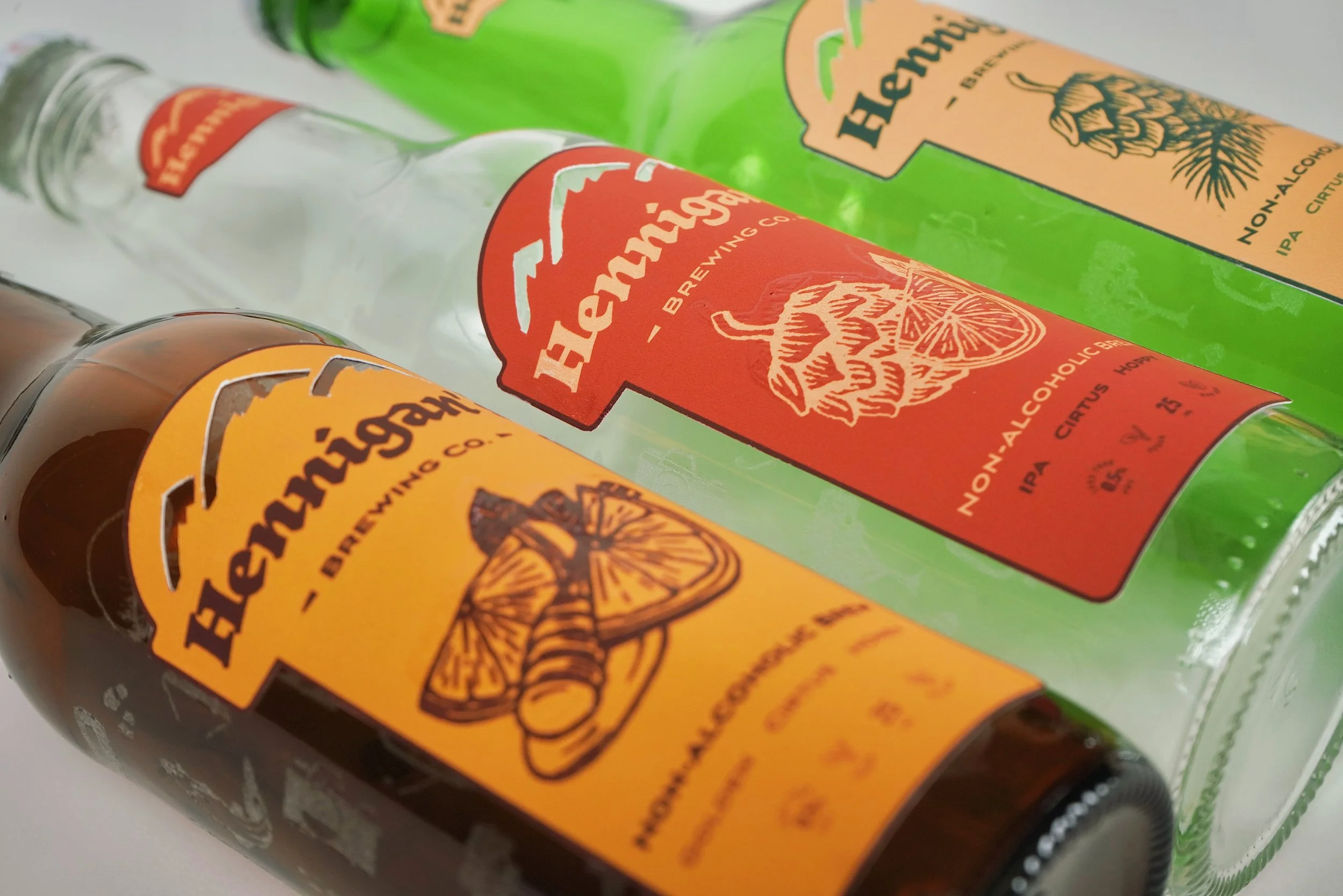
Label Development
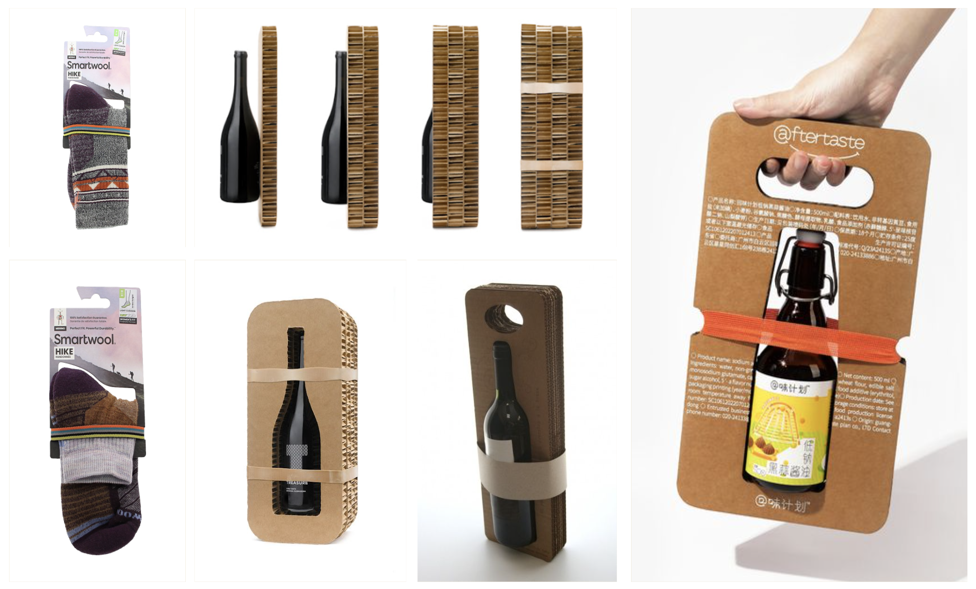
Initially, different illustrations and placements were tested, considering how best to integrate the design with the product flavors. It was ultimately decided that the illustration pattern should be etched onto the glass bottle itself, rather than on the label, to create a distinctive and sophisticated look that sets Hennigan’s apart from other products in the same market. This choice enhances the tactile and visual experience, allowing the label to remain clean and clear for product information while the etched glass adds a unique, high-quality touch.
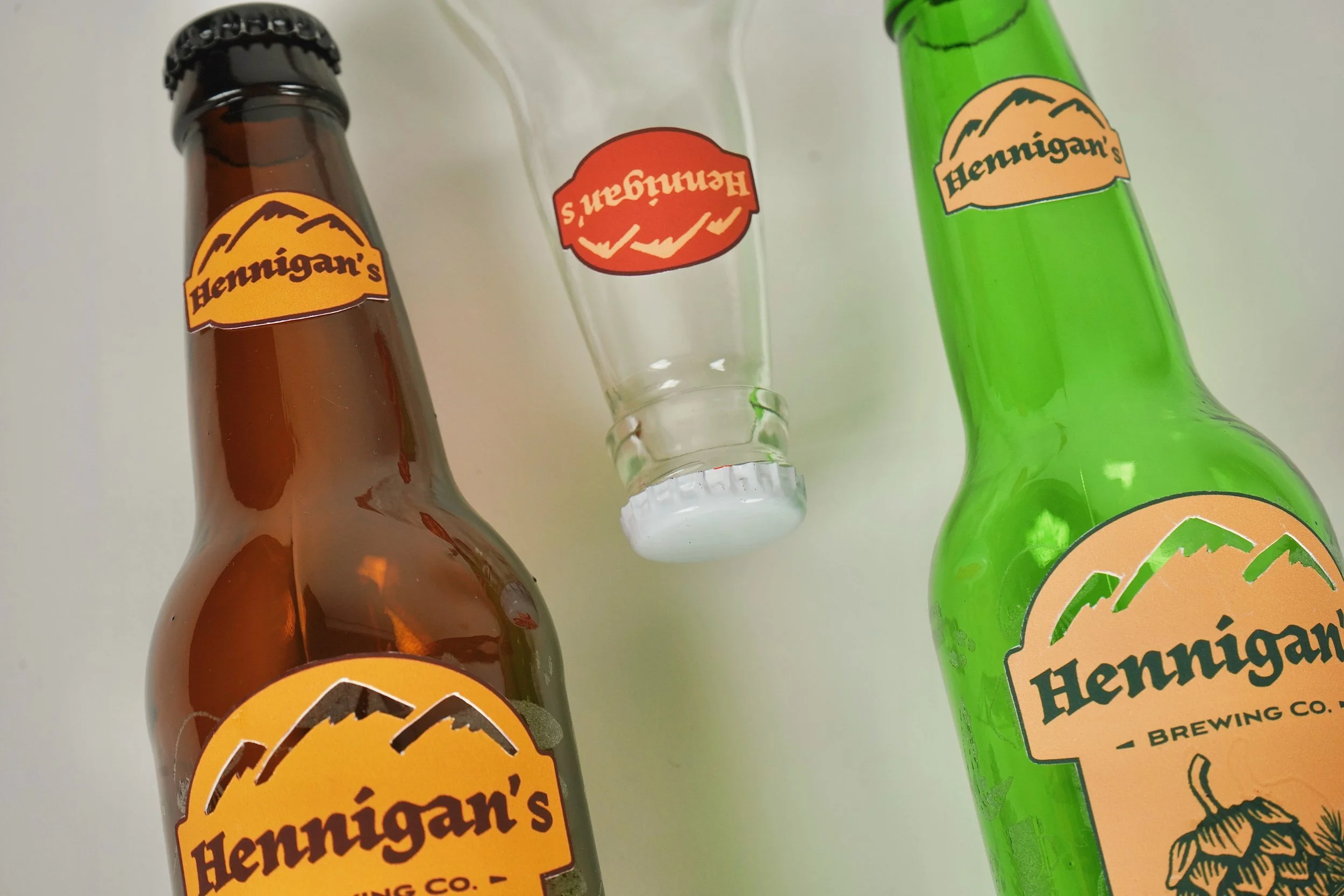
Result
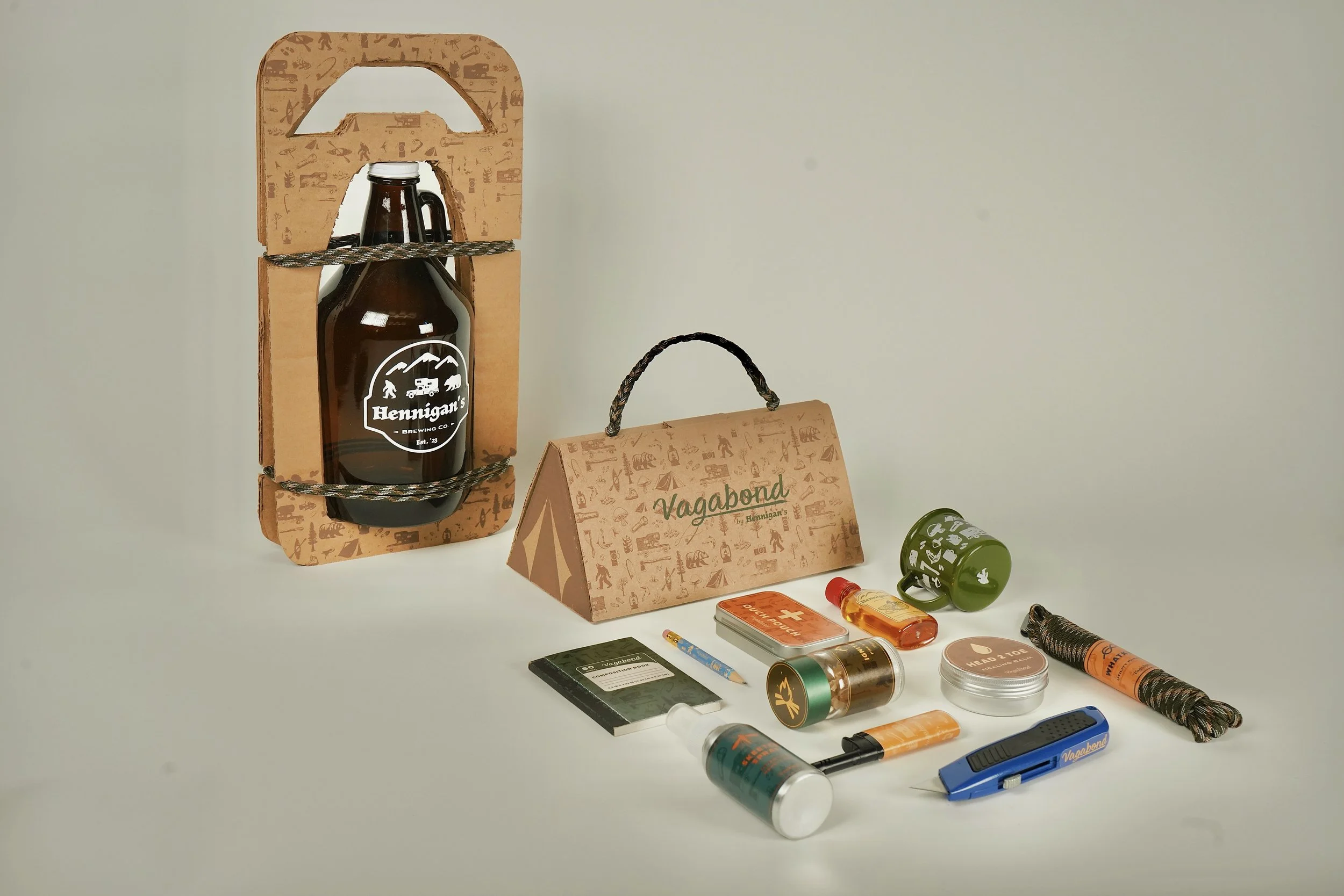
02— Sustainable Carrier
Moodboard
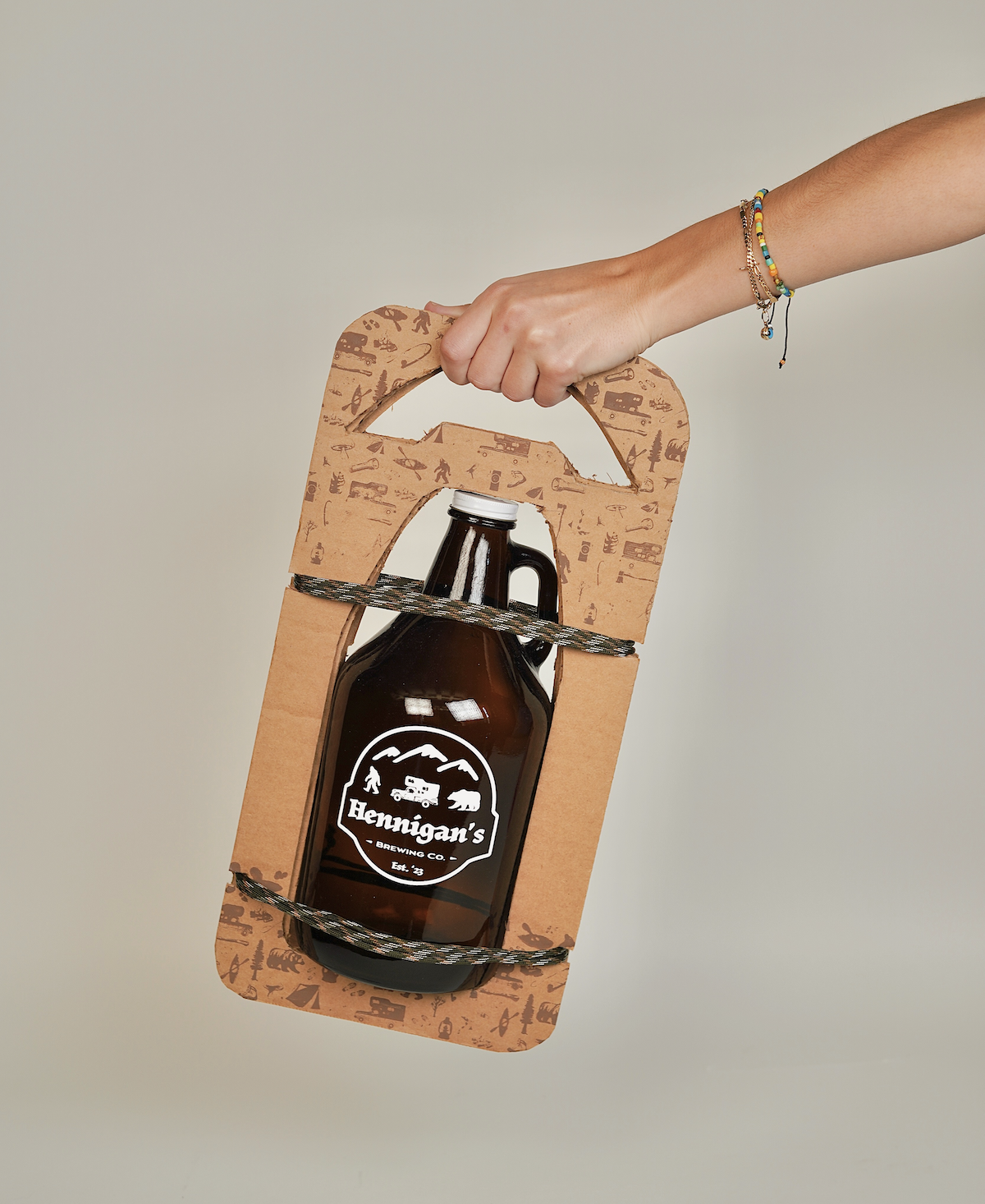
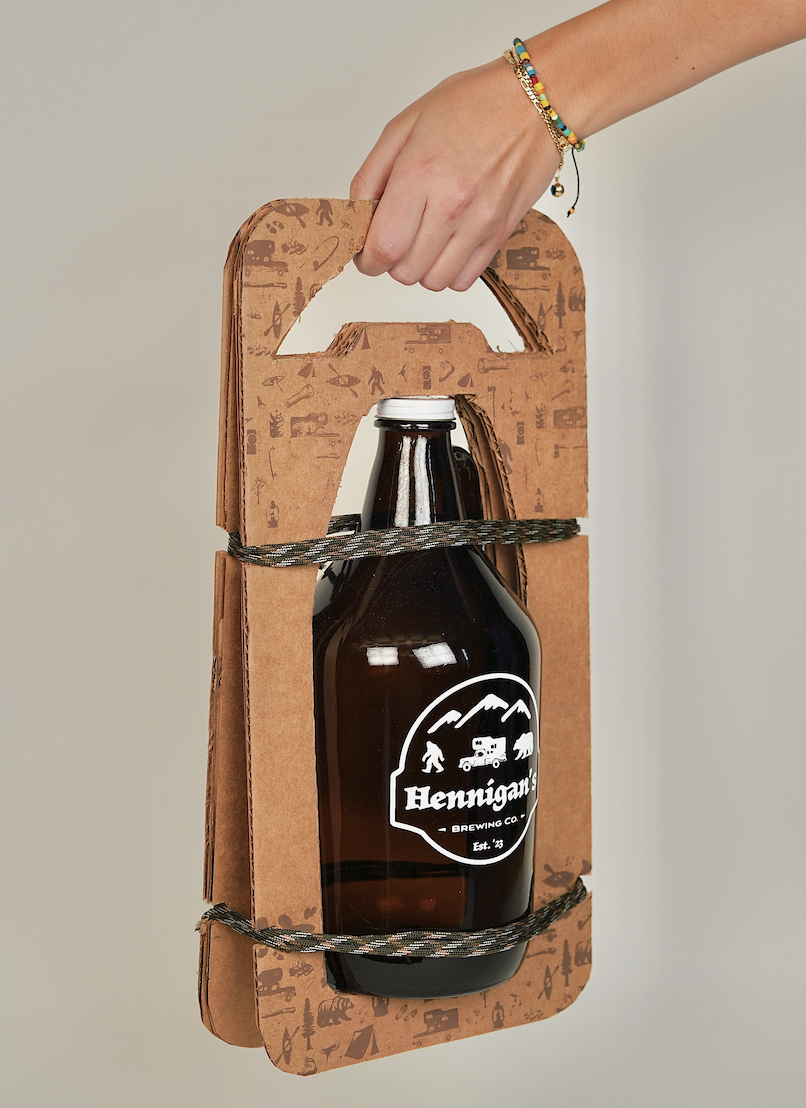
Use recycled corrugated cardboard
Use multiple sheets to be thick enough
Secure the bottle using a band that can be repurposed later
Use carrying case as another layer of branding
Screen-print illustration pattern to top and bottom edges
Maintain tonal color palette for packaging
Slightly darker brown pattern on cardboard
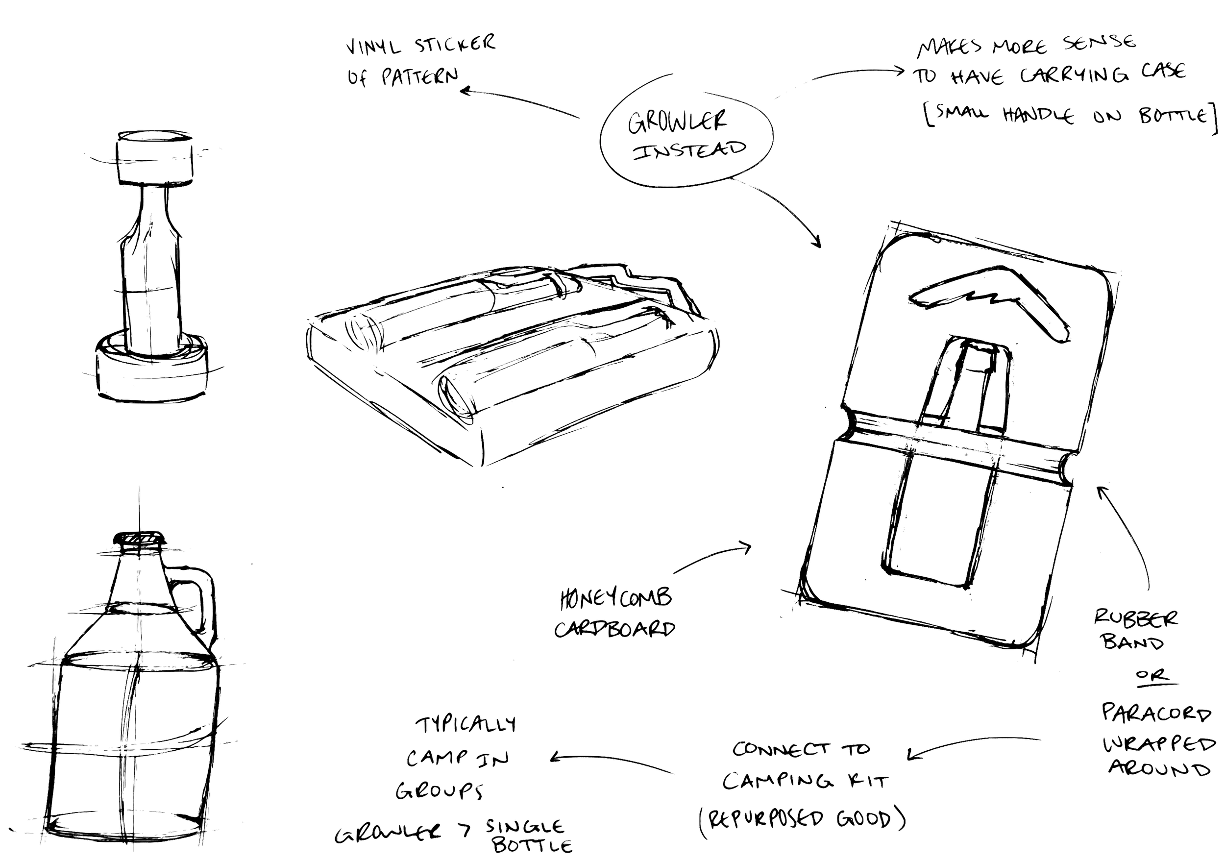
Paper Sketches
Materials
Reuse:
Utilize recycled cardboard boxes
Repurpose:
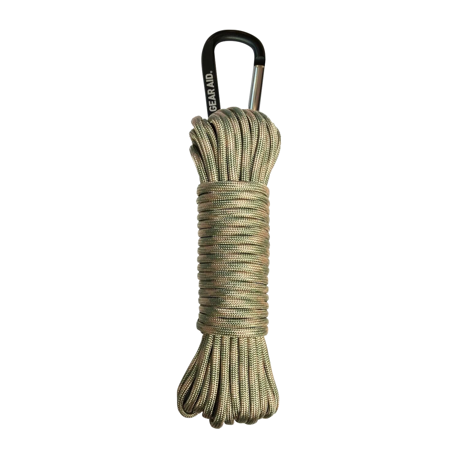
Secure case with paracord
Can serve many functions after box is recycled
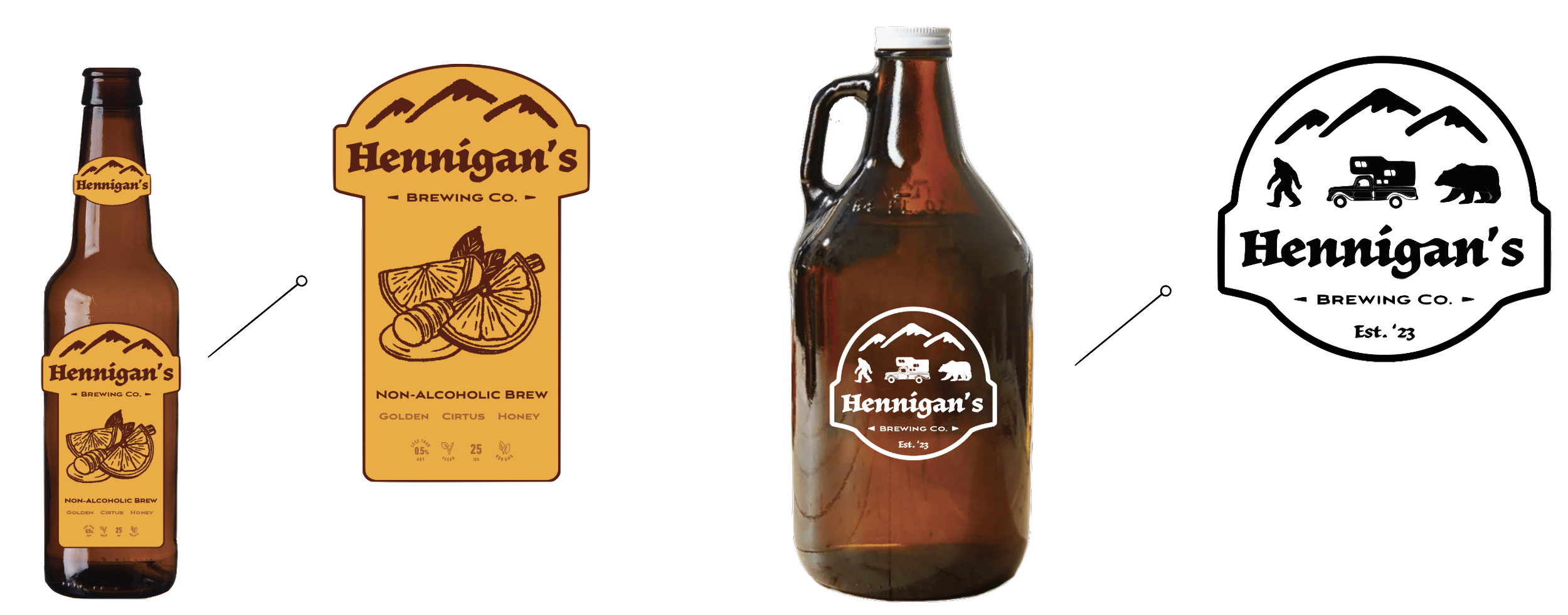
Label Conversion
Removed flavor illustration
Can fill growlers with any flavored beverage
Screen-printed white ink onto amber glass
Made a badge using the three main icons
Incorporating humor into the label design by having the bear follow the “humans” who are following the mythical Sasquatch
Result
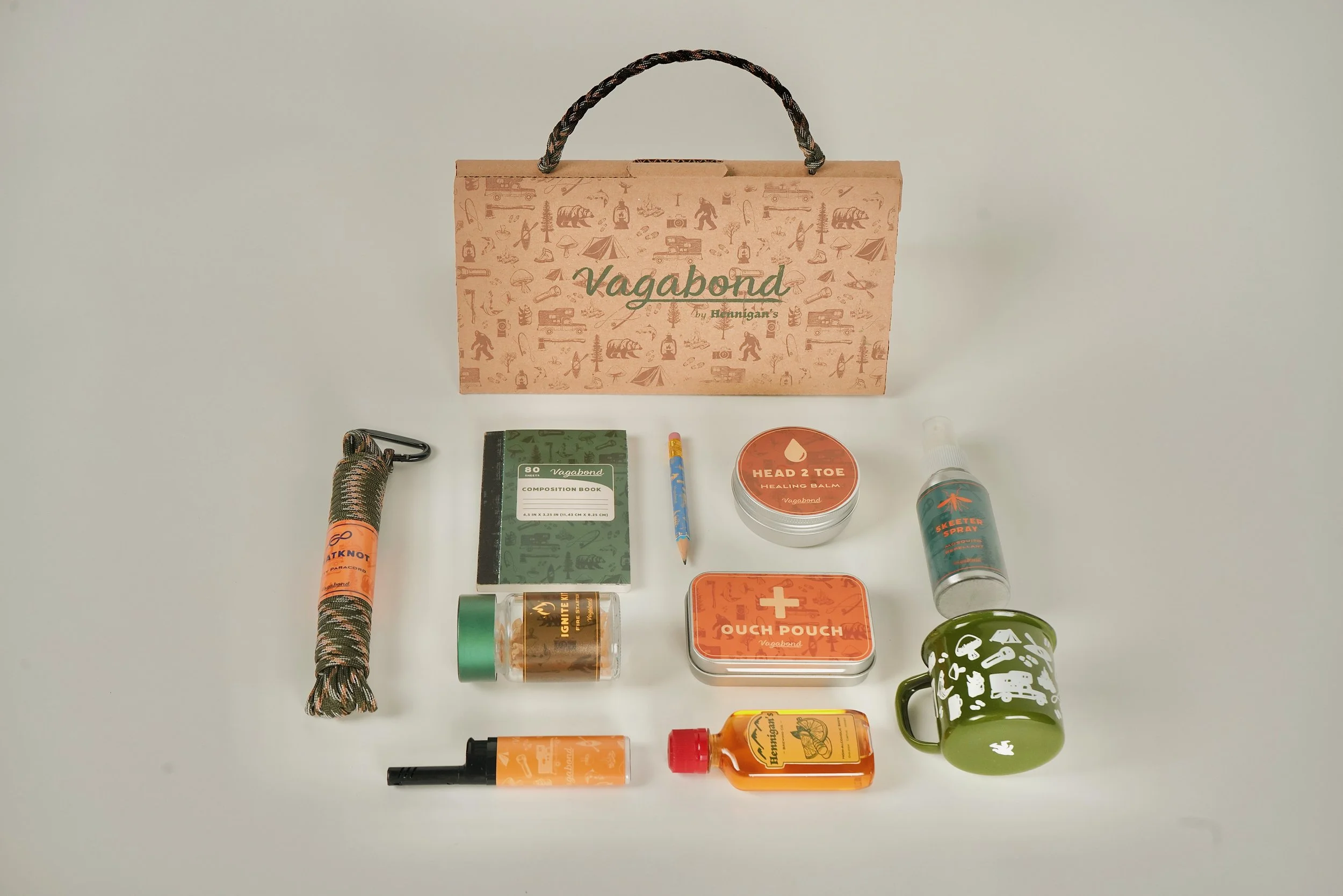
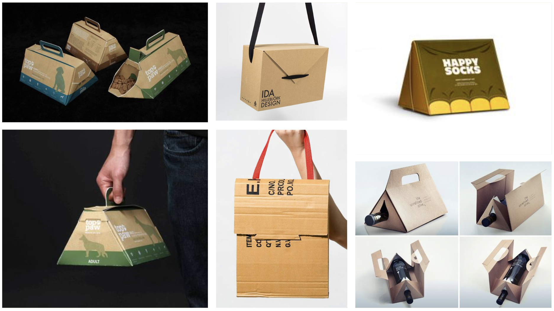
03— Camp Starter Kit
Moodboard
Functional tent-shaped box that folds into itself
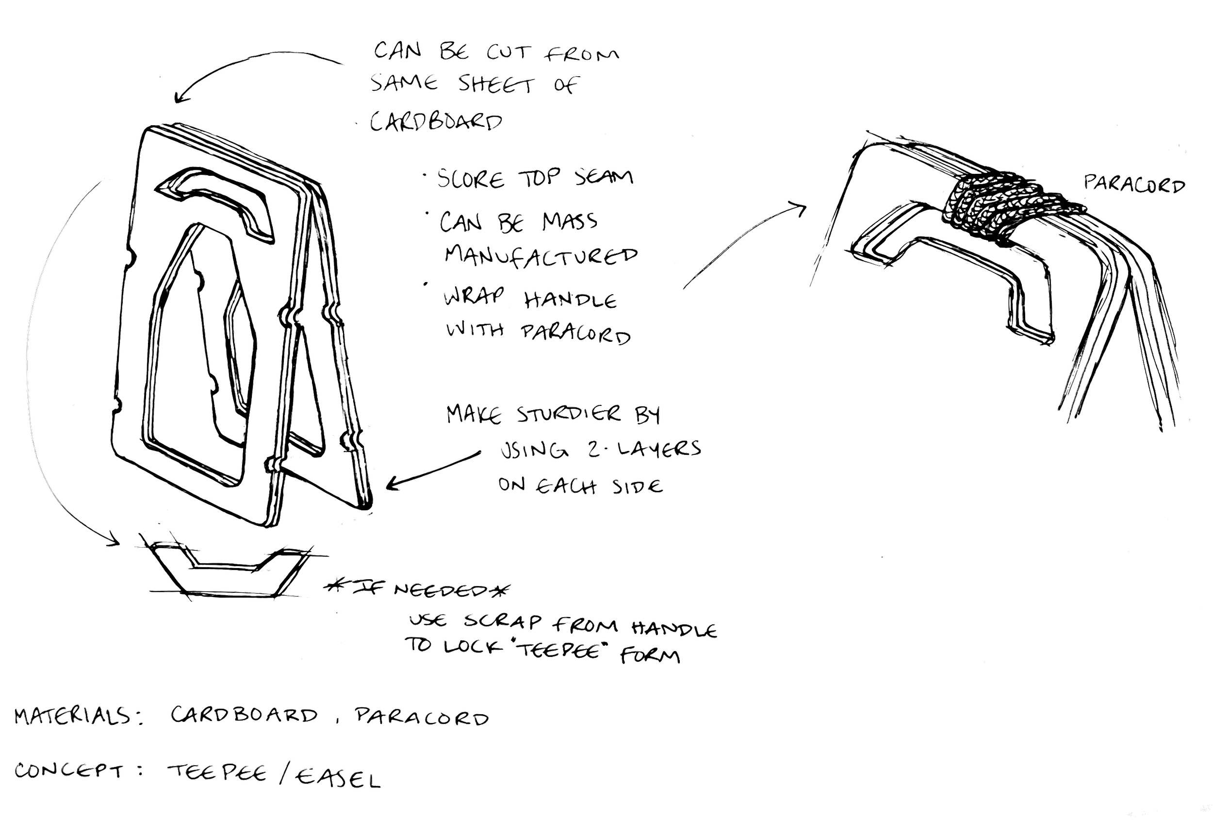
Looking at different types of handles
Material options: cardboard, fabric strap, rope
Use screen printing techniques to achieve tent door and consistent branding
Handheld, portable, easy to open and close, stores supplies
Sustainable, reusable materials
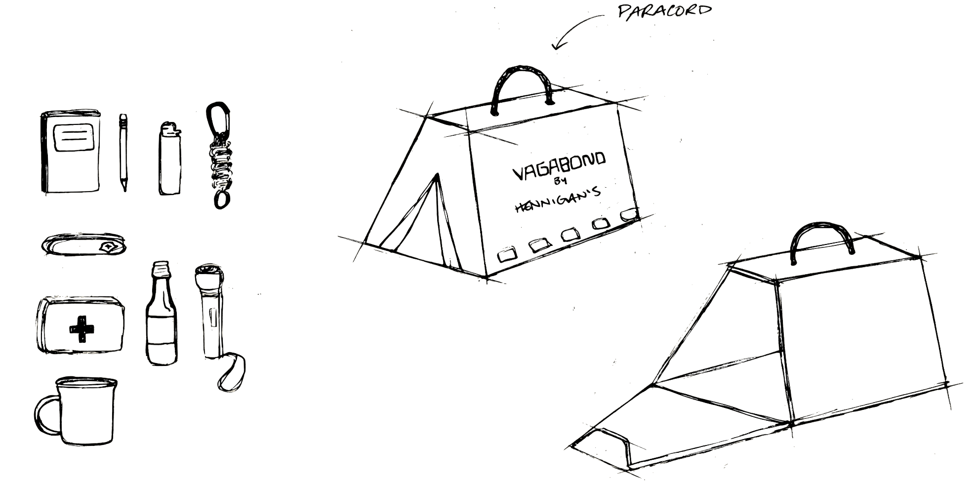
Paper Sketches
Triangular prism shape to allow space for the handle
Brainstorming items to include in the kit
Side opening/closure on the tent door side
Materials
Reuse:
Utilize recycled cardboard boxes
Repurpose:
Secure case with paracord
Can serve many functions after box is recycled

Label Conversion
Designed a sub-brand logo with an adventurous feel
Customized the typeface so the 'g' extends to frame 'by Hennigan's' below it
Screen-printed a pattern illustration and tent door opening in tonal brown to match the cardboard
Screen-printed the logo in a contrasting green to complement the nature theme and paracord
Result