
Hamilton Wayzgoose ‘23
Hamilton Wood Type Wayzgoose Conference Branding
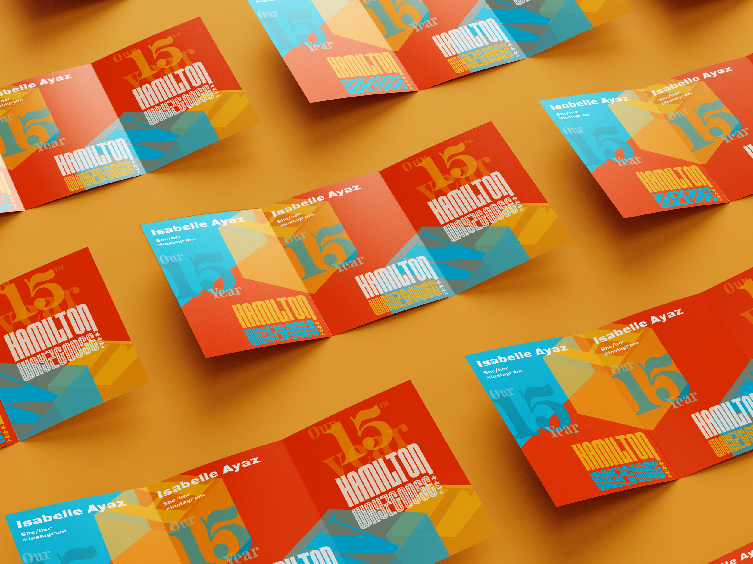
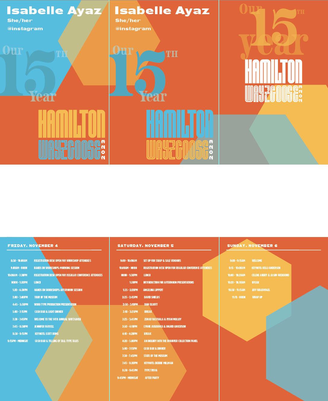
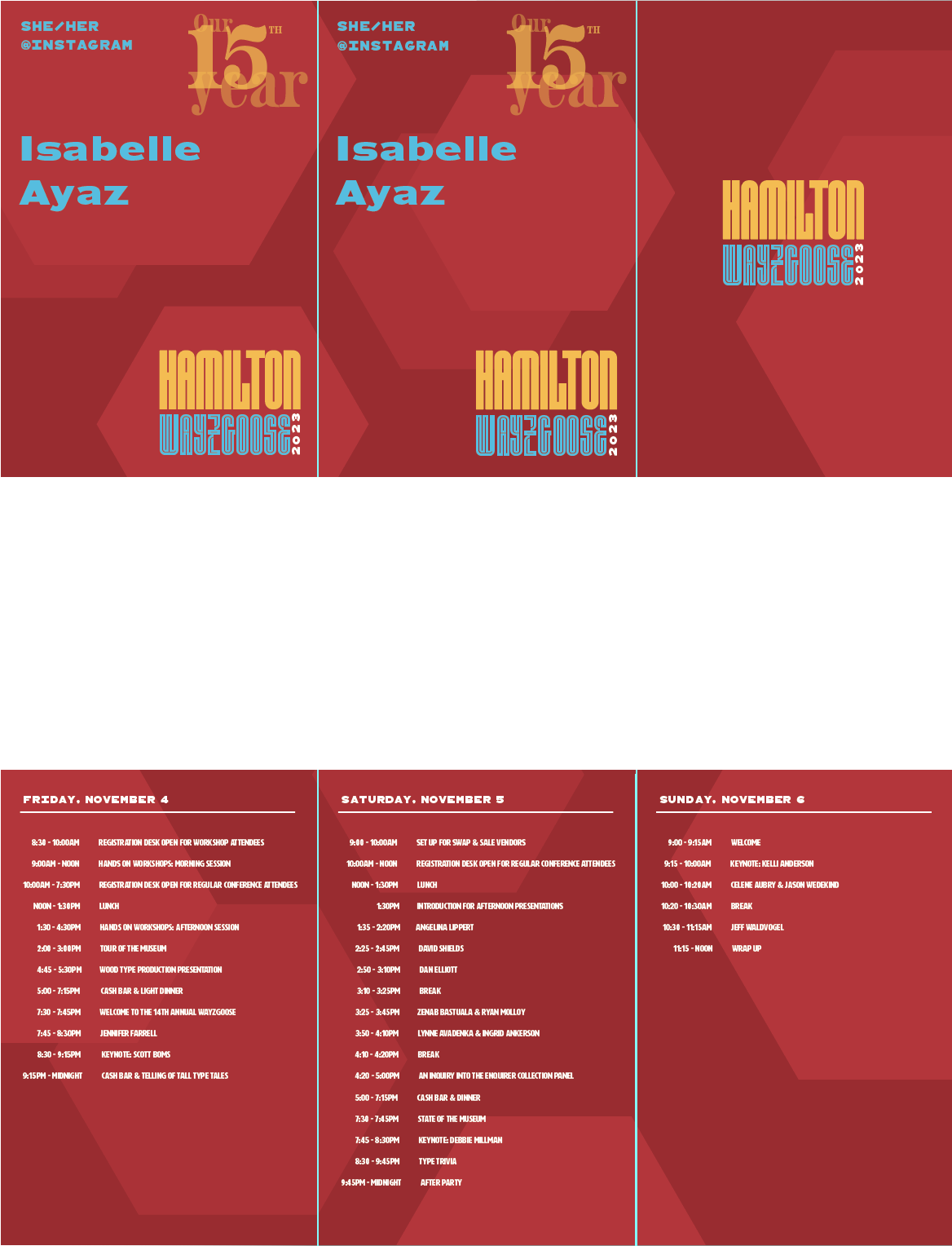
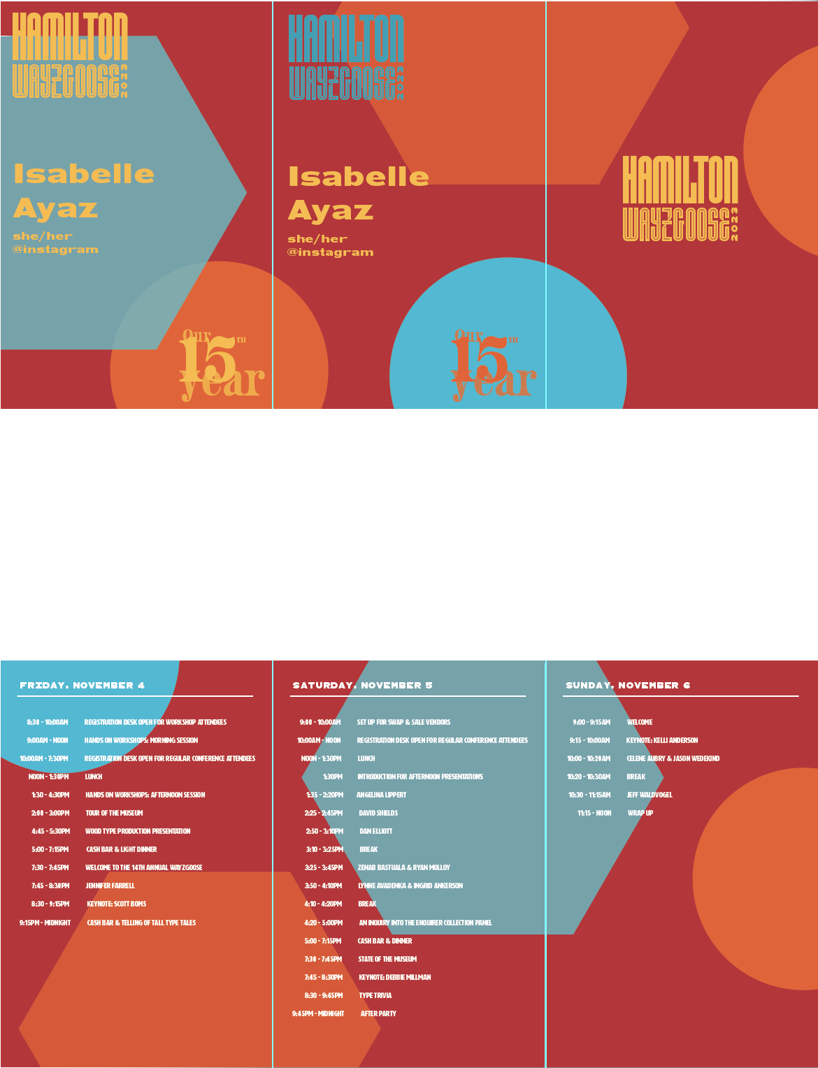
Inspired by the aesthetics of letterpress wood-type blocks, I thoughtfully incorporated the museum's initials into the brand identity. Overlaying them with the "15th Year" callout allowed for a tasteful layering of color, ensuring a visually compelling design without overwhelming the viewer.
Design Focus & Tools
Pamphlet Design, Identity Design
Adobe Illustrator

The Concept
Crafting a captivating visual narrative, I embarked on a journey to seamlessly integrate the museum's distinct color palette into the project. My approach was both audacious and welcoming, employing a fusion of diverse shapes, deliberate play with scale and color, and a penchant for tilting forms. These elements were meticulously envisioned during the project's nascent stages, reflecting my commitment to innovation and artistic exploration.

gif Animation
Create a loop
Maintain the same playfulness that the typography emulates