

Resilient Fitness
Personal Training
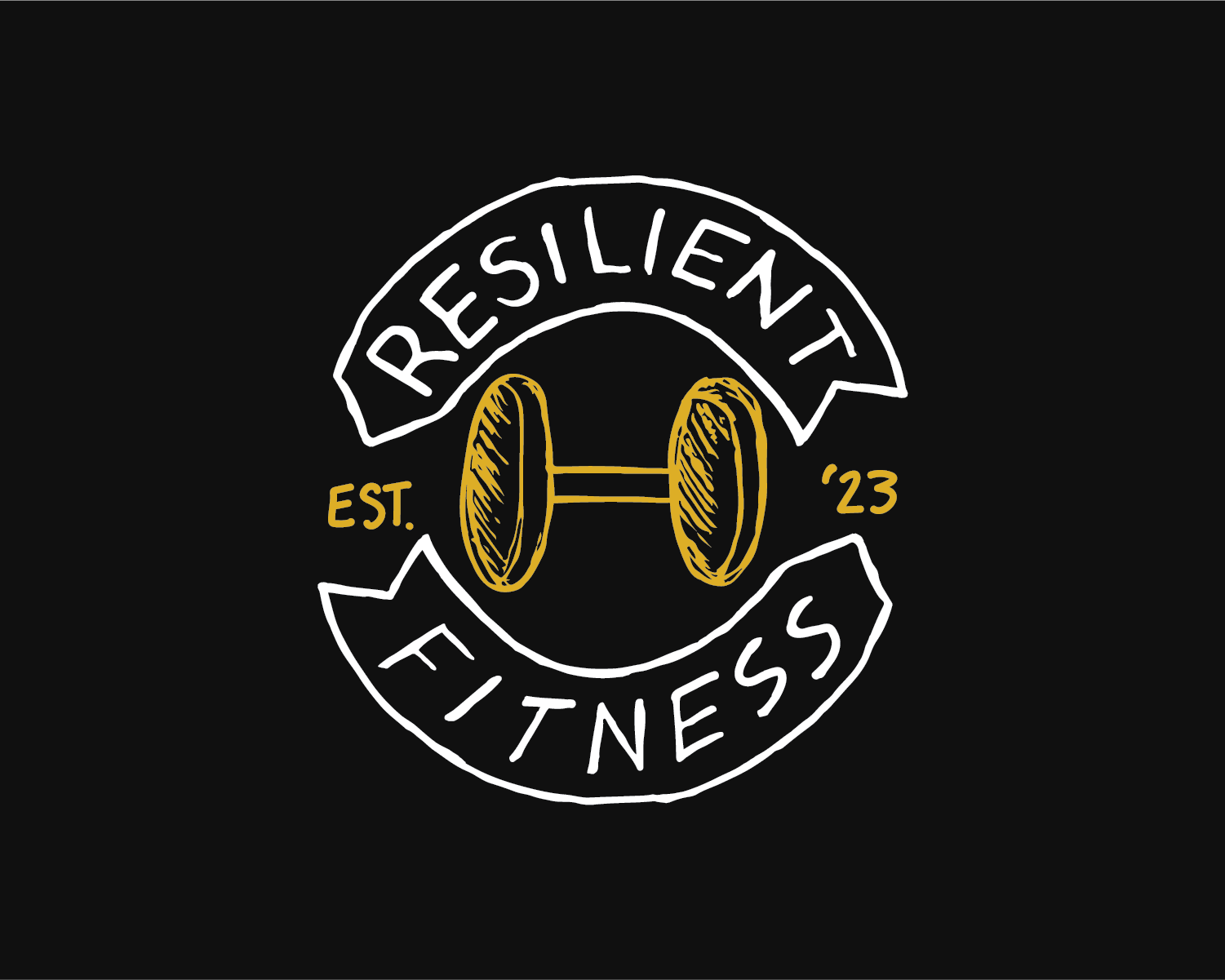
This design encapsulates the essence of the brand's ethos, symbolizing resilience, strength, and determination. This cohesive fusion of elements communicates Resilient Fitness's commitment to empowering individuals on their fitness journey, instilling confidence and endurance.
Design Focus & Tools
Identity Design
Adobe Illustrator, Adobe Photoshop

The Concept
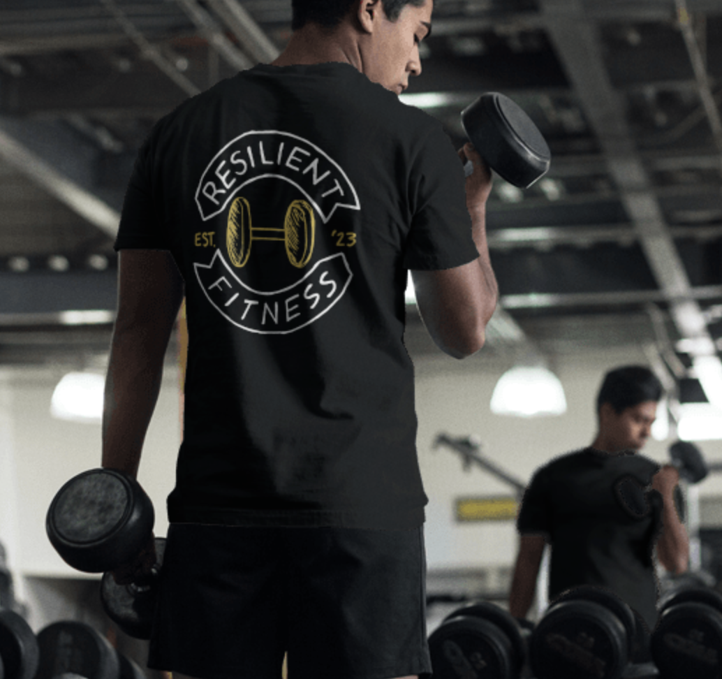
After exploring and brainstorming numerous badge designs, I carefully selected two logos that embody the strength and resilience of the brand. My objective was to create designs with a rugged, hand-drawn feel. In line with the client's preference for a limited color palette of black, white, and yellow, I developed two interchangeable badge styles. These badges are versatile, intended for use across merchandise and gym-related equipment.

The Design
During the digitization process of refining the sketches, my priority was to preserve the texture and imperfections of the hand-drawn logo. These hand-drawn elements carry a distinctive character and authenticity that fully digital designs may lack. By maintaining these imperfections, the authenticity of the original concept is upheld. Embracing the texture and irregularities of hand-drawn elements reinforces the brand's values and personality, establishing a deeper connection with its audience.